💡Explain benefits on sign up page
A/B tests to improve registration inspired by Zoom, Hotels.com & Baremetrics
Friends,
It’s been a whirlwind of a month, but I am glad to be able to catch my breath and get back to writing. I have written a lot about companies and their founding stories, and upon reflection over the last 6 months, I realized that it makes more sense for First 1000 to focus on the micro instead of the macro.
There are many reasons for that, but mostly it is because I spend 99% of my mental energy in the weeds. Forcing myself to take a step back, see the bigger picture, and analyze market dynamics and strategies is an interesting intellectual exercise. It is also draining to do week over week.
Here goes the first issue of the new first 1000
Explain benefits on sign up page
The key to boosting registrations is clearly articulating the benefits of your product on the sign-up page.
Today, I will explore 3 different experiments that will teach us more about how to do this effectively.
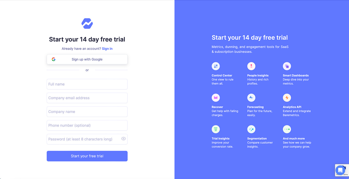
💡 Experiment 1: Baremetircs
Highlighting product benefits on their sign-up page was more effective than showcasing user quotes.
💡 Experiment 2: Hotels.com
A callout with benefits to creating an account performed better than taking users straight to the registration flow
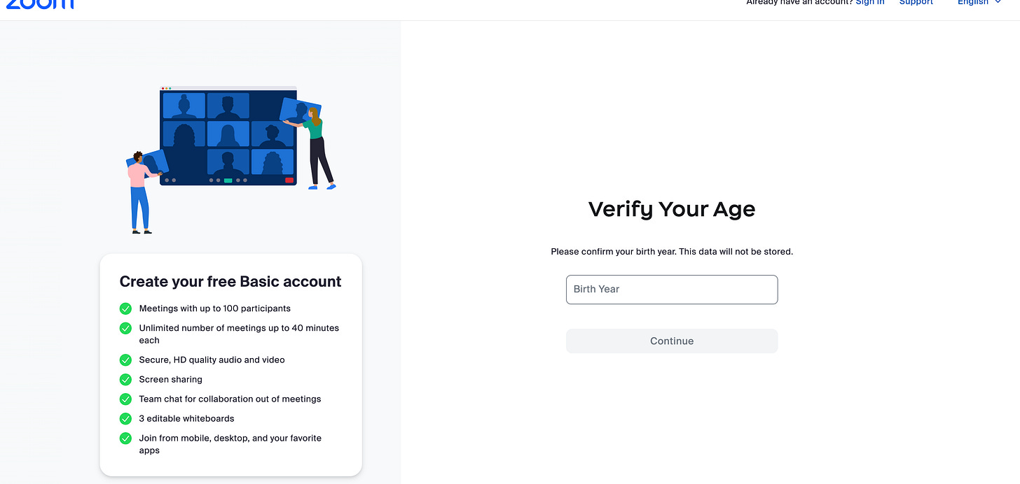
💡 Experiment 3: Zoom
Adding the benefits of a free basic account to the start of the registration flow improved conversion.
Remember: experiments are like diets; what works for one person may not work for you.
See you in 2 weeks 😉,
Ali Abouelatta


