📖 How to write CTA copy (for paywalls)
A deep dive into the CTA copy for the top 100+ apps on the App Store
Hello Friends 👋,
At Duolingo, we spend a lot of time and energy optimizing every single part of the user experience by running and learning from hundreds of A/B tests.
I wanted to gut check the CTA copy for our purchase flow that we experimented our way into against what I would cringely call “industry standard.”
The process was simple:
Download the top 10 apps in every category on the App Store
Write down the CTA copy in an Excel
Look for trends and trend breakers.
Here is what I learned:
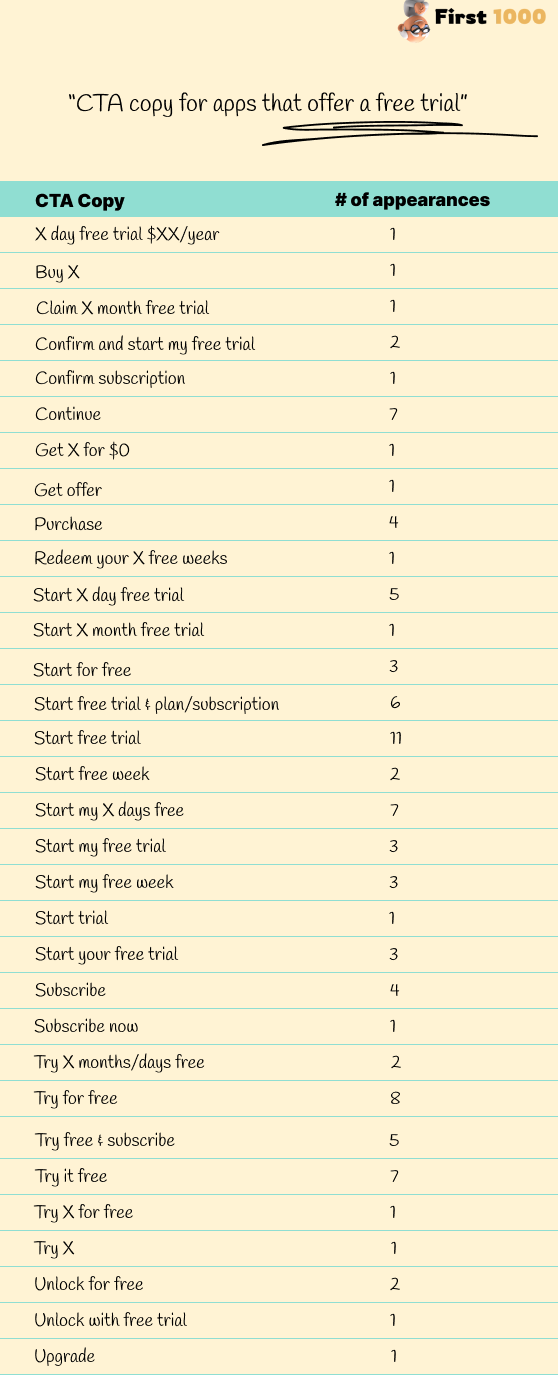
The most common CTA for a free trial-eligible app:
It uses Start as a verb and mentions Free. Only 20% use first or second-person pronouns (my, your).
Start free trial, Start free 7 days.The most common CTA for apps with no free trial:
It is 1-2 words short and action-oriented. 45% of CTA are only one word, 85% are three or less.
Subscribe, Continue, Subscribe Now.
👀 Deep Dive
Free Trial Offers:
Common Verb Usage: "Start" dominates, present in 40% of CTAs, signifying the beginning of a journey. The next most common verb is “Try.”
Word Count: 90% are at 5 words or fewer. A detailed breakdown shows 40% use exactly 4 words, with 3 words or fewer being less common, suggesting brevity with sufficient detail strikes a balance.
Mentioning "Free": Saying Free in the CTA is virtually obligatory; 80%+ of apps mention “Free” or “for $0” in their CTA
Additional Words: Adding time specifics appears in 25% of CTAs, underscoring the limited availability and prompting quick action.
No Free Trial:
Common Verb Usage: "Continue" leads at 30%, and "Subscribe" follows at 25%, pointing to progression or a commitment, respectively.
Word Count: A tendency towards fewer words, with 85% at or under 3 words. Specifically, 26% use 3 words, 14% opt for 2 words, while 1-word CTAs appear 45% of the time
Pricing Information: Explicit pricing is less common but still significant at 20%, indicating transparency is valued.
General Observations:
Personalization: "My" is employed in only 10% of free trial CTAs, implying that creating a sense of ownership and personal benefit is not the biggest needle mover.
Action-Oriented Language: Imperative verbs are a constant across all CTAs, used to drive immediate user action.
Clear Value Proposition: 100% of CTAs maintain clarity in their value proposition, be it a trial, subscription, or pricing clarity.
Best Practices for CTA Copy:
For Free Trials: A 4-word structure like "Start 7 day free trial" is the most common pattern, used by 30% of the top 100 apps.
For No Free Trials: An action oriented and short 1 -2 word CTA like “Continue” or “Subscribe now” is the most common pattern.
Pricing Transparency: Display pricing in the CTA where advantageous and when the price point is a strong part of the value proposition (e.g. limited time offer), as seen in 20% of non-free trial apps.
Urgency and Exclusivity: Include time constraints or exclusivity for 25% of free trial CTAs to boost conversion rates through a sense of urgency.
This was fun ✌️.
See you soon,
Ali Abouelatta


