
🎬 Netflix
Test Everything!
Hello Friends 👋🏾,
The internet is a beautiful place.
Over the years, I have used the Internet Archive for research pieces on First 1000.
Today, I am using it differently.
I went back over the last year four years of Netflix's life to learn about experiments they ran to improve conversions.
The insights presented here are equally valuable and worth experimenting with, whether for a company looking to acquire its initial 1000 users or for a massive multi-billion dollar corporation.
—
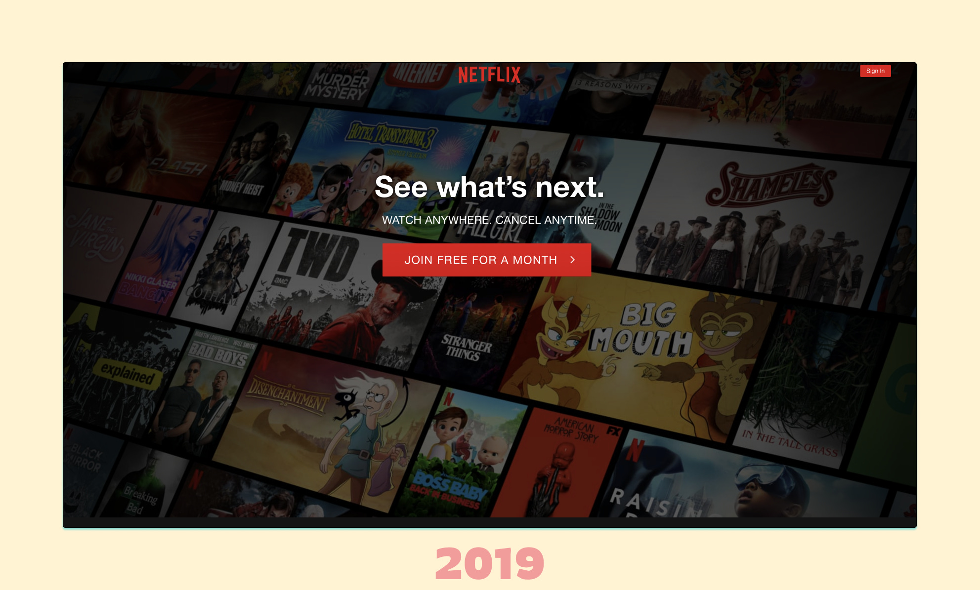
2019 vs 2023
Over the last 4 years, Netflix’s landing page underwent a series of changes. In this issue, I will focus on 7 experiments Netflix ran throughout that timeframe to arrive at where they did today.
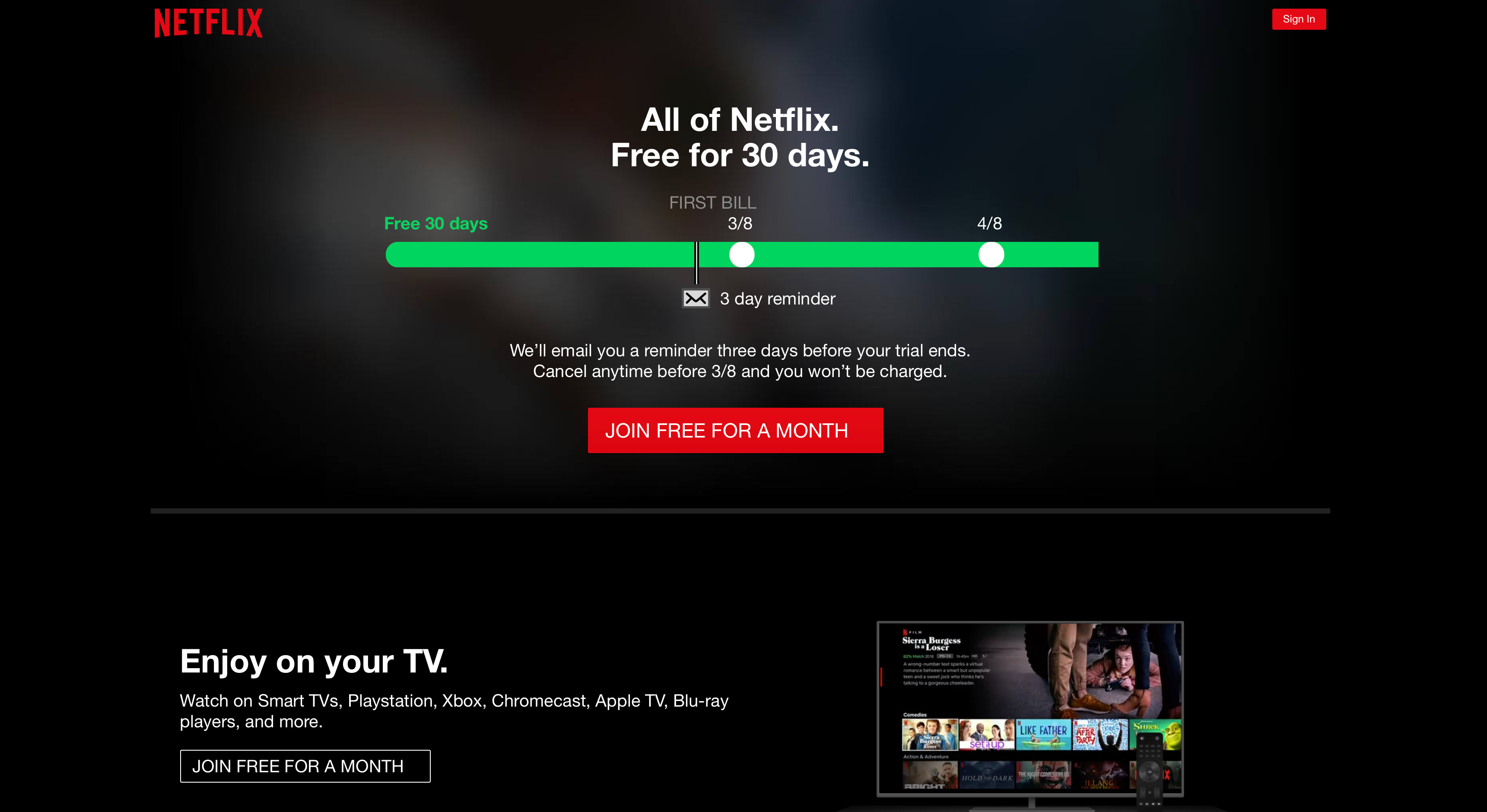
This is our starting point 👇
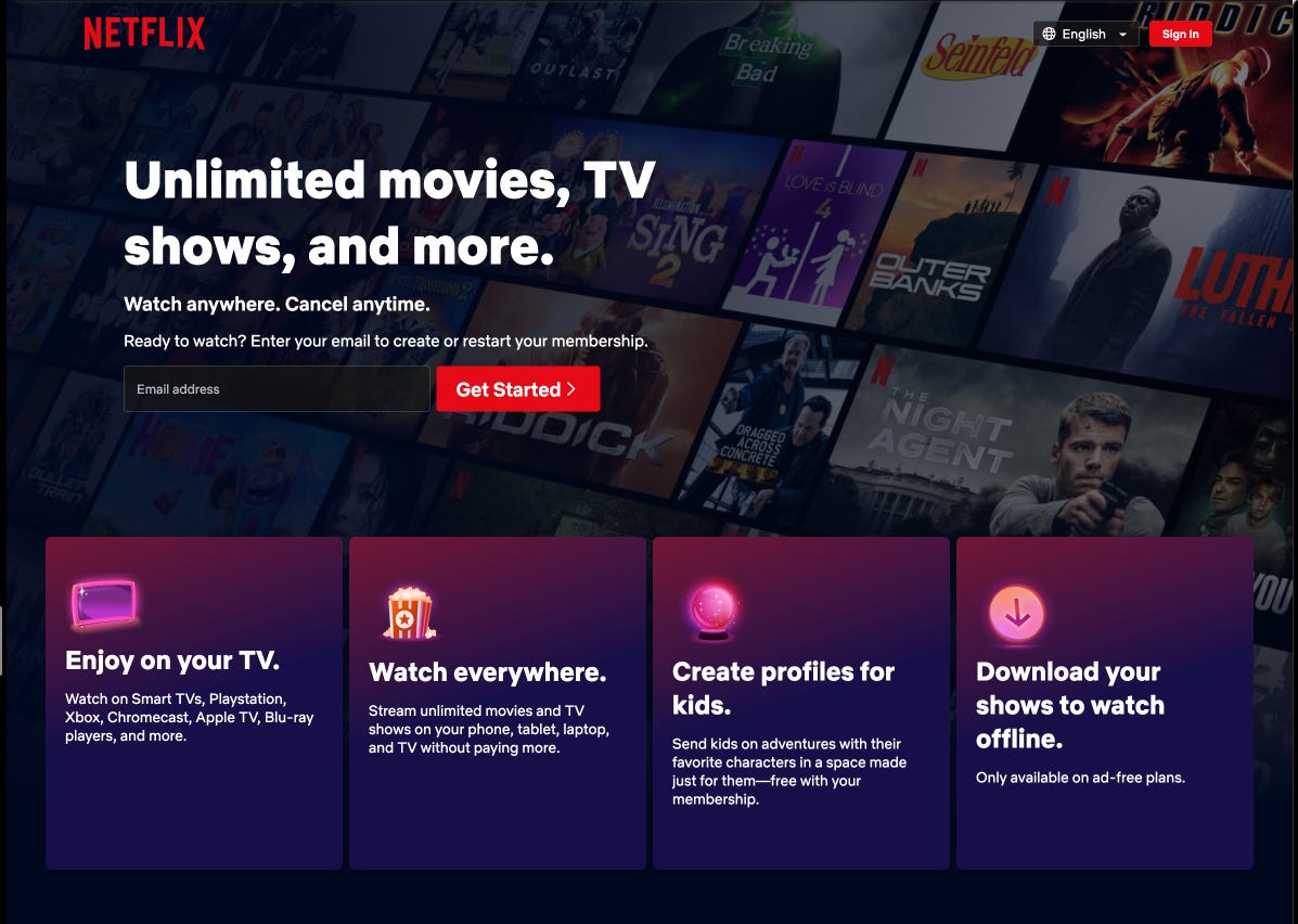
And this is our destination 👇

—
Experiment 1: Adding a notification timeline for renewal reminder
Netflix pioneered the “notify me before the trial ends” timeline design pattern that many consumer subscription companies now utilize
Control: “See what’s next.”

Arm 1: Timeline + Enter Email + CTA
✅ Arm 2: Timeline + CTA only (Winner)

Lesson 1: Preemptively address the user's concerns (i.e., “I will forget to cancel”)
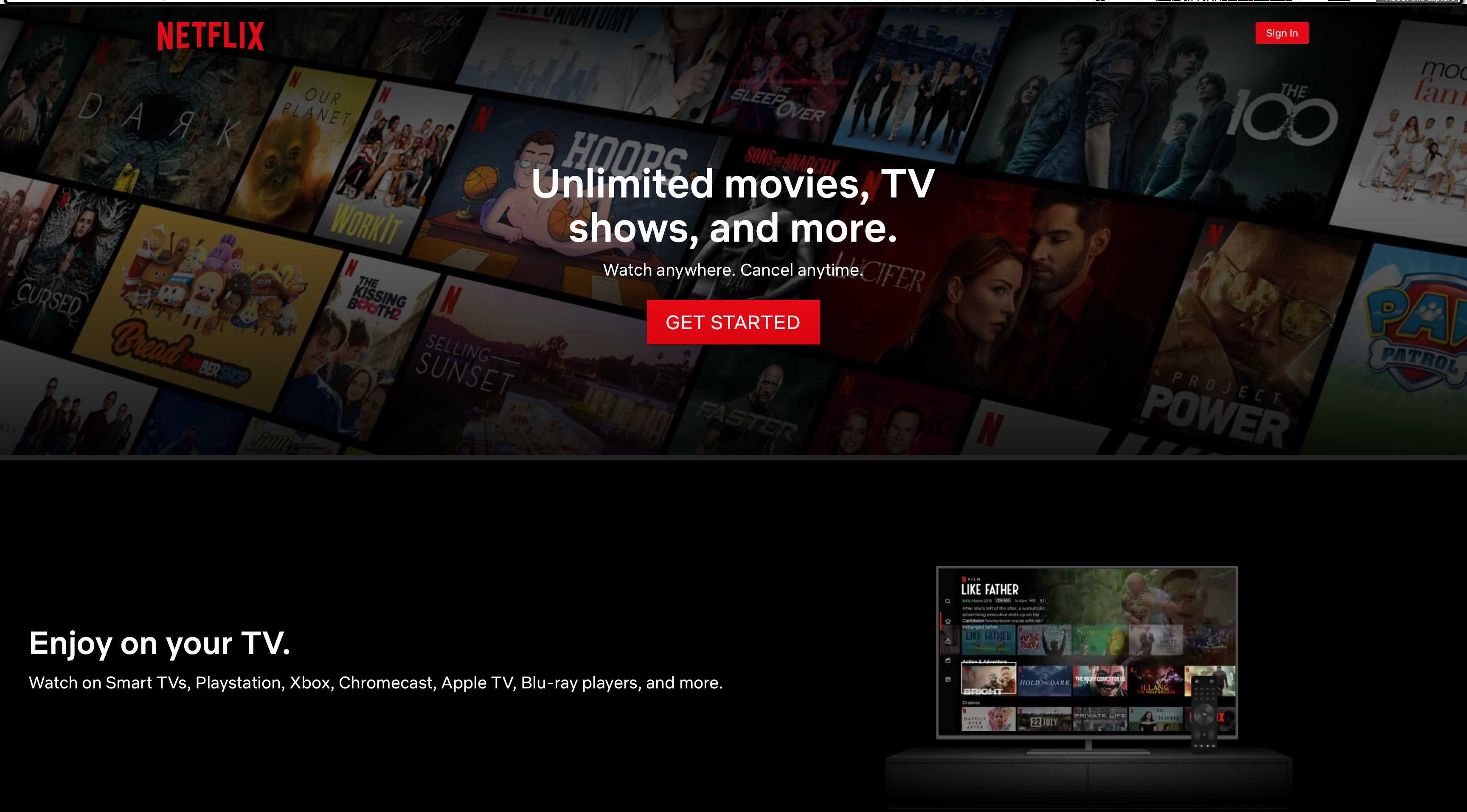
Experiment 2: Test different CTA’s for Timeline
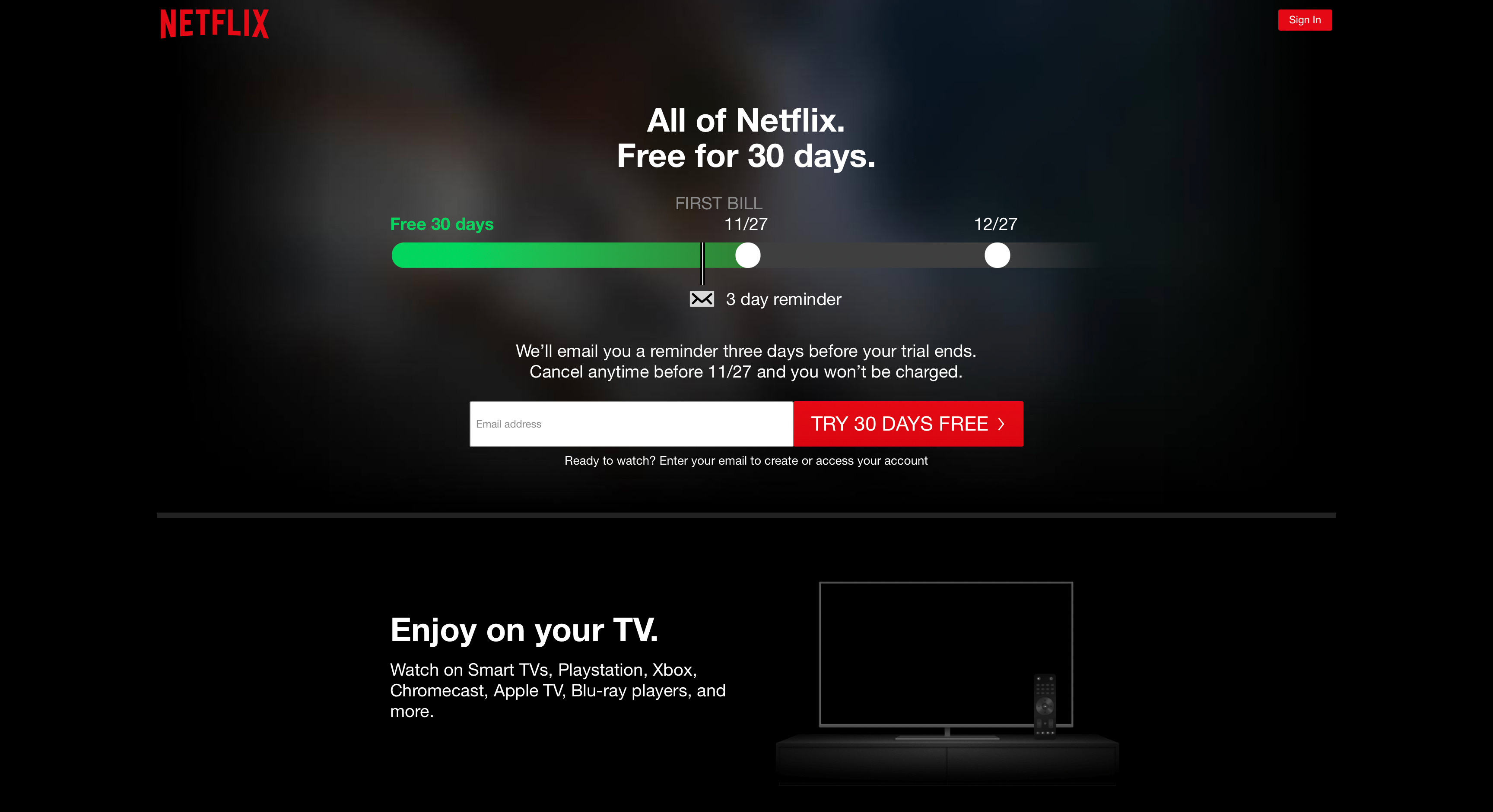
Control: “Try 30 days free.”
✅ Arm 1: “Join Free for a month” (Winner)

Arm 2: “Start 30 days free.”

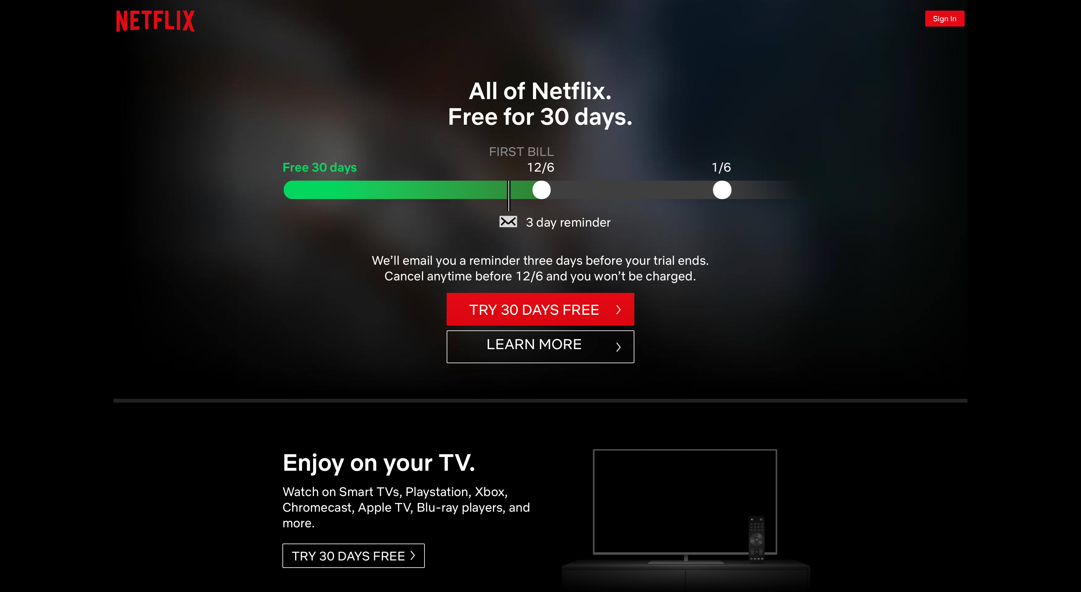
Arm 3: “Try 30 Days Free” + “Learn More.”
Lesson 2: Test Everything!
Experiment 3: Replacing timeline with email input field
In this experiment, Netflix revisited a losing pattern (having the email input field on the landing page). This time without the notification timeline for the end of the free trial reminder.
Control: Timeline + “Join Free for a month”
✅ Experiment: Email input + “Try 30 days free” (Winner)

Lesson 3: Revisit the old hypothesis.
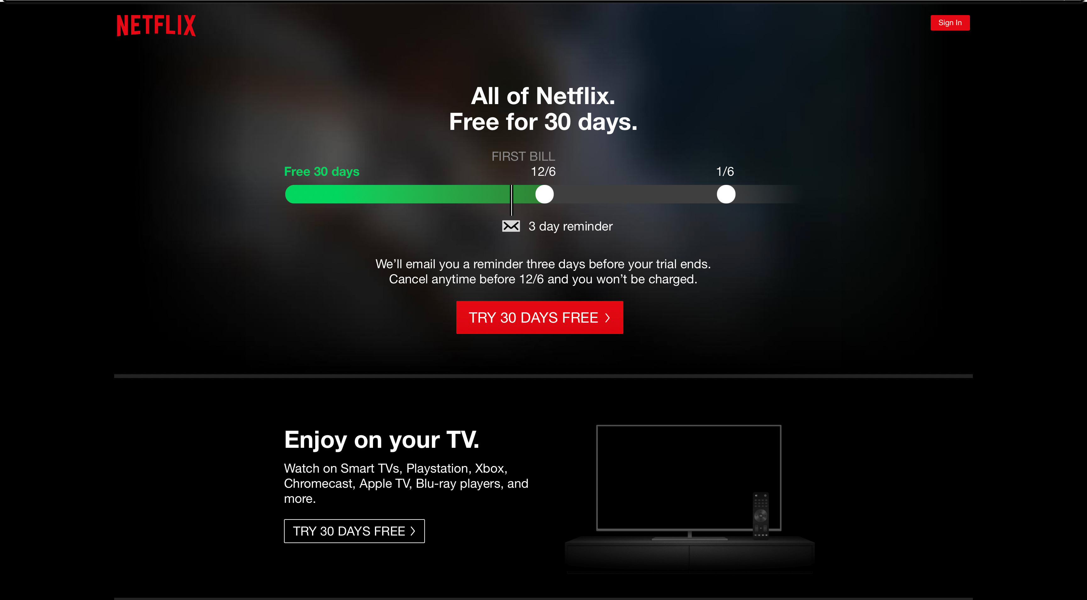
Experiment 4: Email input vs. not
A few months after “Email input” + “Try 30 days free” won, Netflix ran an experiment to test removing the Email input but keeping the same CTA copy
✅ Control: Email input + “Try 30 days free” (Winner)

Experiment: “Try 30 days free”

Lesson 4: Run learning experiments even if you “know” the experiment will lose.
^^In this case, Netflix ran a prior test with two changes (CTA copy + Input field). This experiment helped them identify where the gains came from.
Experiment 5: Get Started vs. Try 30 days free
When Netflix wanted to stop offering free trials in 2020, they experimented with a new CTA copy, “Get started.”
In that experiment, they tested having an email input field vs. not (for both CTA copies) despite it winning in prior experiments.
Control: Email input + “Try 30 days free”

Arm 1: “Try 30 days free” only

✅ Arm 2: Email Input + “Get Started” (Winner)

Arm 3: “Get started” only
Lesson (again): Test everything & revisit old hypothesis
Experiment 6: Transparent Email Input
After Netflix introduced the ad-supported plan earlier this year, they experimented with making the input field transparent.
This draws more eyeballs to the lower-tier plan banner (the highest contrast element on the page) without sacrificing the importance of Email Input + Get Started.
Control: White background Email Input

✅ Experiment: Transparent Email Input (Winner)

Lesson 5: Use contrast (or lack thereof) to your advantage
Experiment 7: Redesigned header
In this last experiment, Netflix did extensive overhauls to its landing page.
The winner was the same old page, with the addition of a gradient banner to highlight the new ad-supported tier.
✅ Arm 1: Bottom of Page Gradient Banner (Winner)

Arm 2: Gradient Header

Arm 3: Gradient Value propositions
Arm 4: Gradient Input Field

Lesson 6: The more information you highlight, the less powerful the message is.
Key Takeaways:
Revisit old hypothesis & Test Everything.
Netflix retests old design patterns when new information is available. They did that with
#Exp 2: Testing Email Input without Timeline (despite losing in the original timeline experiment)
#Exp 5 Testing removing the Email input field when they got rid of free trials
Cluttering is a losing proposition.
Another theme is that every arm that added more CTAs and complexity to the user experience lost:
#Exp 1: Adding email input field + Timeline for renewal reminder lost
#Exp 2: Adding “learn more” to Timeline for renewal reminder lost
#Exp 7: Highlighting all the different value props of Netflix lost.
Constraint your use of contrast
# Exp 6: Netflix making its email input transparent.
The new tier banner stood out a bit more, improving conversions.
# Exp 7: Netflix experimented with highlighting more things on the page
More highlighting lost!
Remember, just because these experiments worked for Netflix doesn’t mean they will work in other contexts.
Test everything!
Until next week 😉,
Ali Abouelatta