🧪 Positive friction
Friction isn't always the enemy, laziness is!
Hello Friends 👋🏾,
If there’s one secret I learned at Duolingo, it is the power of positive friction.
What is positive friction? Positive friction is adding both value and effort to the user experience at the same time.
Generally, it is much easier to successfully remove friction from the user experience than to add it because, surprisingly, even the tiniest uptick in effort can deter users unless offset by substantial value.
This is why positive friction can seem counterintuitive when it really isn’t!
1) Retention
The first example of using positive friction to get users to form long-term habits comes from an experiment I shared on X.
For users starting a new streak on Duolingo, we experimented with showing them an extra screen after they did a lesson. Everyone who saw it had to press “Continue” to reach the next screen.
What may shock you is that we didn’t do anything with the “streak goal” users selected on this screen. We didn’t even store the value anywhere.
The result of this experiment was an increase in both short-term and long-term retention gains.
—
Fast forward a couple of years…
We ran a follow-up, adding more friction to the experience; we removed the preselected state. Users were 2 clicks away from exiting the flow instead of 1.
Again, the friction led to short-term and long-term retention gains.
—
2) Registration & onboarding
Nowhere do you see positive friction more than in registration and onboarding flows. Fitness and wellness apps are among the best industries in taking advantage of positive friction early in the user experience.
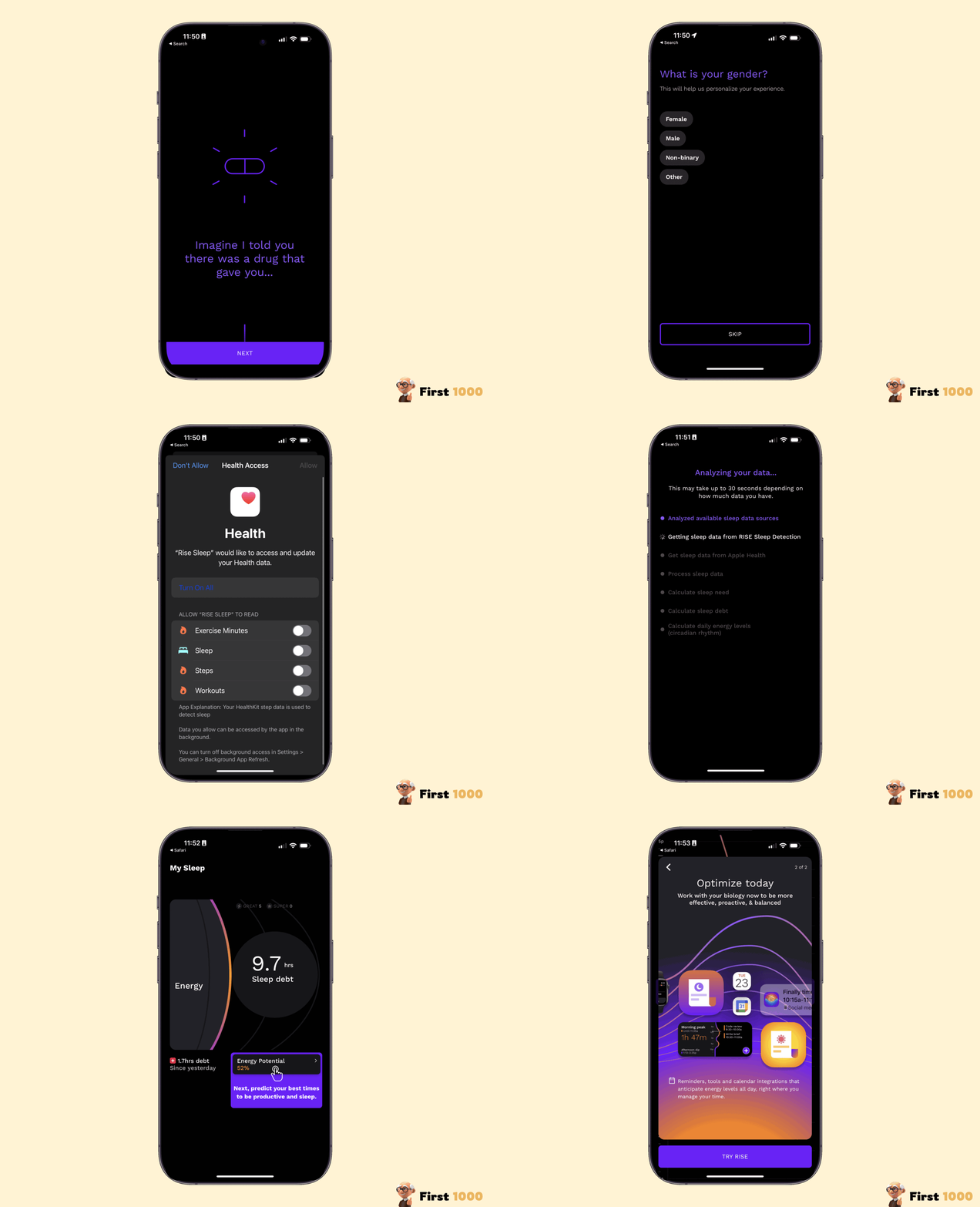
The first example I want to share is from the sleep app Rise.
Rise’s onboarding flow is 43 steps!
Like many other companies in the space, they realized the more screens they added to the onboarding flow, the more personalized and advanced their product appeared to the end users. People valued personalization more than the extra questions they had to answer.
Loona is another app in the wellness space that has an onboarding flow of 19 screens.
This is considered average compared to its peers at the top of the health and wellness app category.
—
Purchase Flow
Another place where positive friction repeatedly shows up is in the purchasing experience. I found that to be a little more surprising than the other flows. Purchase flows are very sensitive and high stakes, two ingredients I thought would make it a bad candidate for introducing friction.
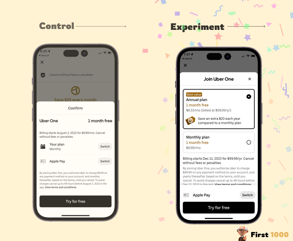
As you will see below, it is almost a rite of passage for consumer subscription companies to start their purchasing experience with a snappy, frictionless experience, then experiment their way into offering more choice and doing so more explicitly than ever.
The first example here is from Flighty, the flight tracking app. Flighty went from a 1-click checkout experience to a clunky swiping view with all the different plans, features, and prices.
Peloton went through the same experience almost to a T when they introduced their freemium tier; they went from an animated, delightful 1, one-step purchasing carousel to an outdated plan comparison purchasing experience.
Even Uber went through a similar experience when they first introduced Uber One.
—
3) Core loop
Positive friction can also be effective in the core action loop of everyday apps, not just in high-stakes one-time flows like registration and purchasing.
For instance, not so long ago Lyft ran an experiment to auto-collapse the pickup time selection “Priority, Standard, or Wait & Save” for a more frictionless experience.
The results were loud and clear; people preferred the optionality over the frictionless experience.
Headspace
Headspace experiment introducing a primer screen in between its locked content and paywall was a winner.
Perhaps not surprisingly educating users on what they will get out of a headspace session caused more people to give a free trial a chance
—
I hope by now you are convinced that friction isn't always the enemy. It’s almost always a win-win for the users and the business when used appropriately.
This is it for today!
Talk soon,
Ali Abouelatta


