💰Registration Paywalls
Why do registration paywalls look different than other paywalls?
Hello Friends,
A few weeks ago I started research for an upcoming post: login methods for the top 100 apps on the App Store.
As you can imagine, I had to go over 100 onboarding flows, some of which were excruciatingly long.
The one thing that stood out through this process was how different registration paywalls looked than other paywalls throughout the remainder of the app.
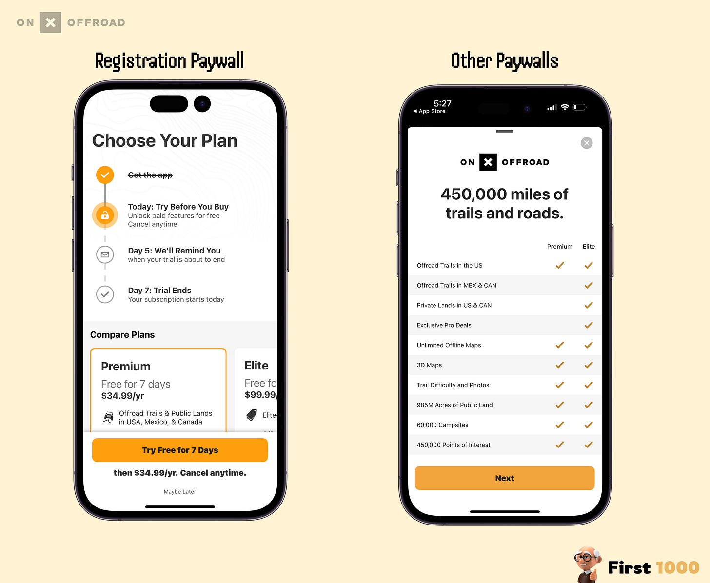
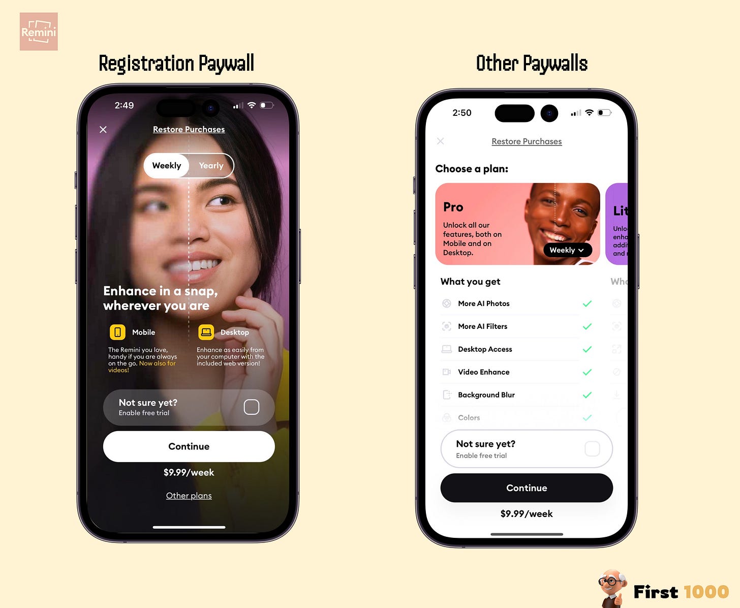
For instance, take a look at the two examples I share below ….do you notice anything interesting 👀?
—
In both these examples, the registration paywall offers less context on what features//benefits you get with the subscription than other paywalls you see post registration.
This was very common amongst the top apps on the App Store, especially for ones with more than 1 subscription tier.
This is it for today,
Ali Abouelatta


