🚗 Uber One: Information Hierarchy
A deeper look into a recent A/B test to reskin Uber's subscription page
Hello Friends 👋
Imagine you are a Product Manager at Uber responsible for their subscription product Uber One.
One of the designers on the team comes to you with two options for the paywall.
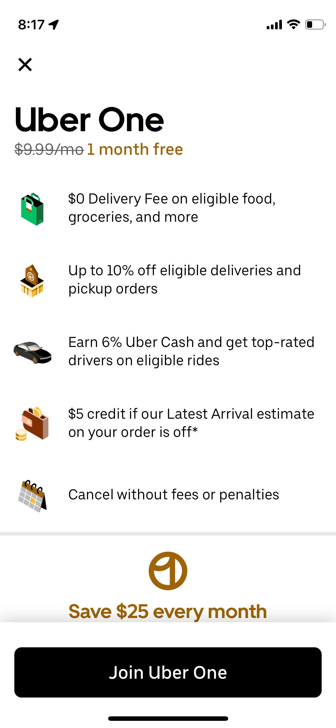
Design A
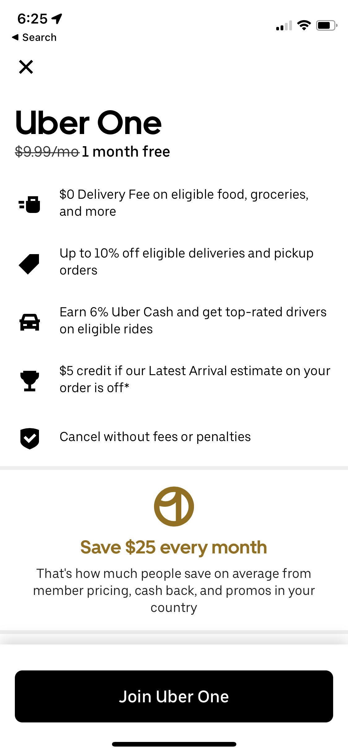
Design B:
Which one would do you think will perform better?
Uber recently ran this test, and design A won!
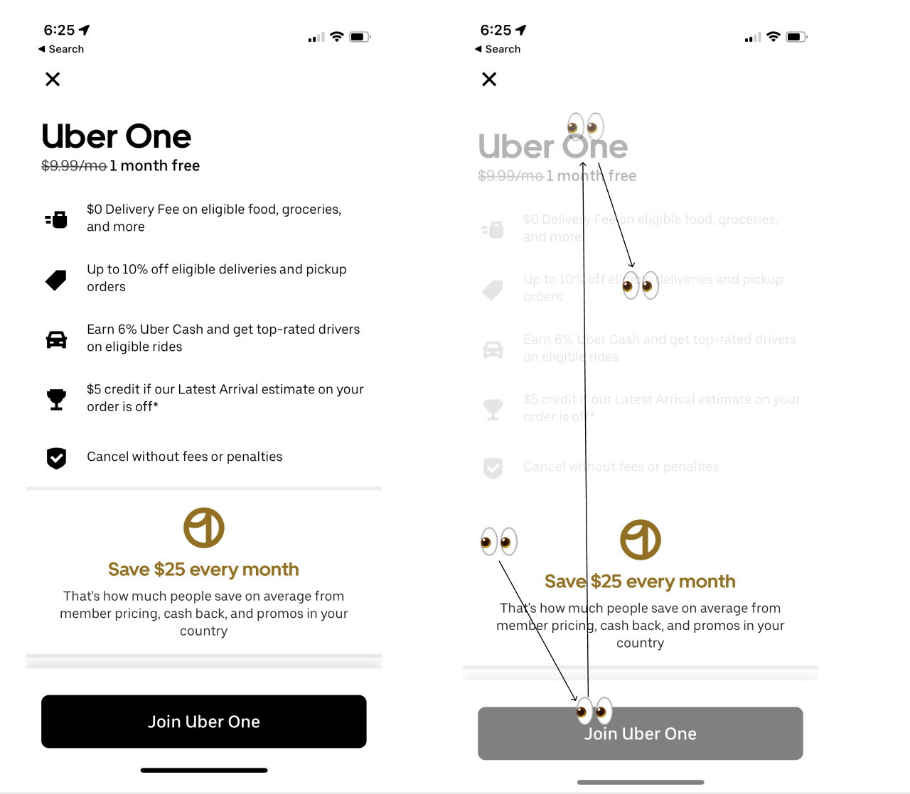
Why? I don’t really know. But an interesting lens is following the information Hierarchy on the page.
Looking at information hierarchy
The way we process information on the page goes from the most salient information on the page to the next, skimming through everything inbetween.
We continue doing so until we have sufficient information to make a decision.
Design A: Information Hierarchy
Design B: Information Hierarchy
Did you notice the key differences about what information stands out in design A vs design B?
Reply and let me know
Until next week,
Ali Abouelatta


