📧 Welcome Emails
Good, Great & Amazing examples
Hello Frens 👋,
I hope you are having a great week.
Today, I wanted to take a look at welcome emails. Done right; welcome emails can accelerate the journey to the first 1000 customers.
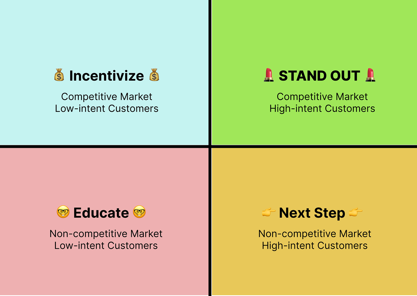
In this research piece, I looked at ~60 welcome emails and segmented them into four flavors, each serving a slightly different purpose depending on the target market and customer:
Let’s jump right in.
1. Incentivizing Users
Getting users to take action by offering a discount. This works for low-intent customers in a competitive market.
Good Example: Priceline
✅ Highlighting Incentive
✅ Clear above-the-fold CTA
❌ Generic Irrelevant Header
❌ Distracting Secondary Prompt: VIP Benefits
❌ Distracting Tertiary Prompt: Download App
❌Distracting Quaternary Prompt: Other Deals (Hotel, Car, Flight)
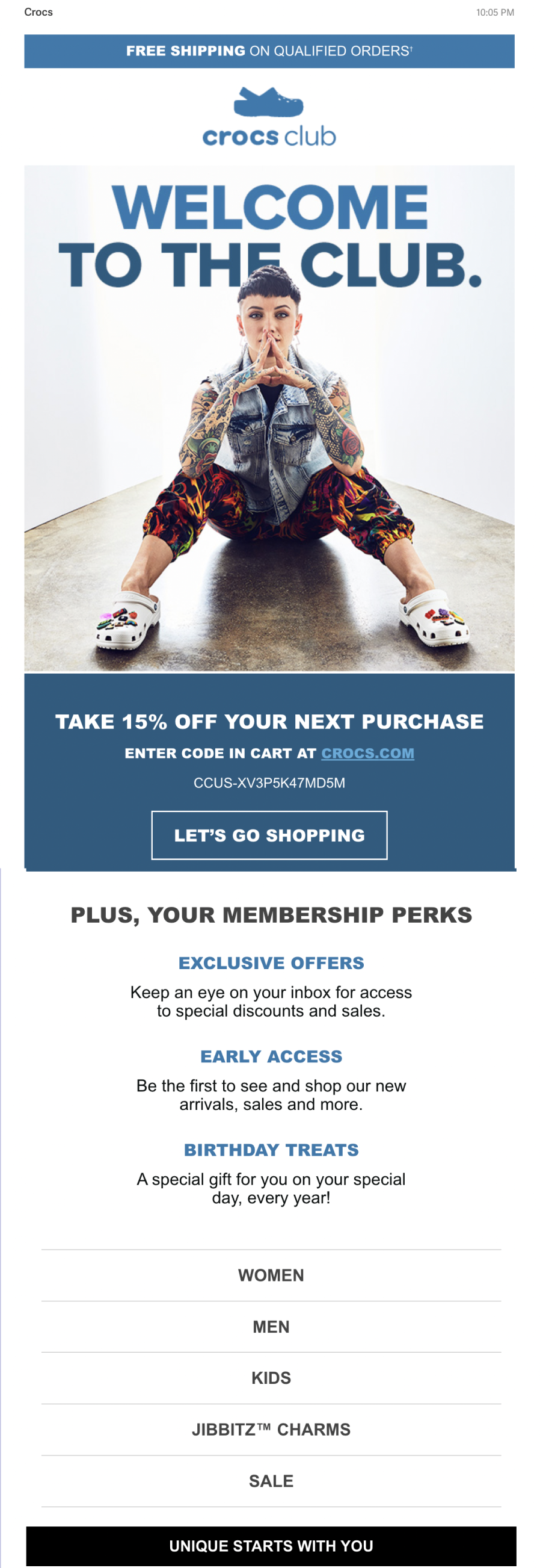
Great Example: Crocs
✅ Visually communicating value proposition: Crocs make you unique
✅ Header Information Hierarchy (CTA > Instructions > Code)
✅ Membership Information Hierarchy (Title > Description)
✅ No CTA button for the secondary prompt (Membership Benefit)
❌ Distracting Tertiary Prompt: Women, Men, Kids..etc
✅ Reinforcing Value Prop: UNIQUE STARTS WITH YOU
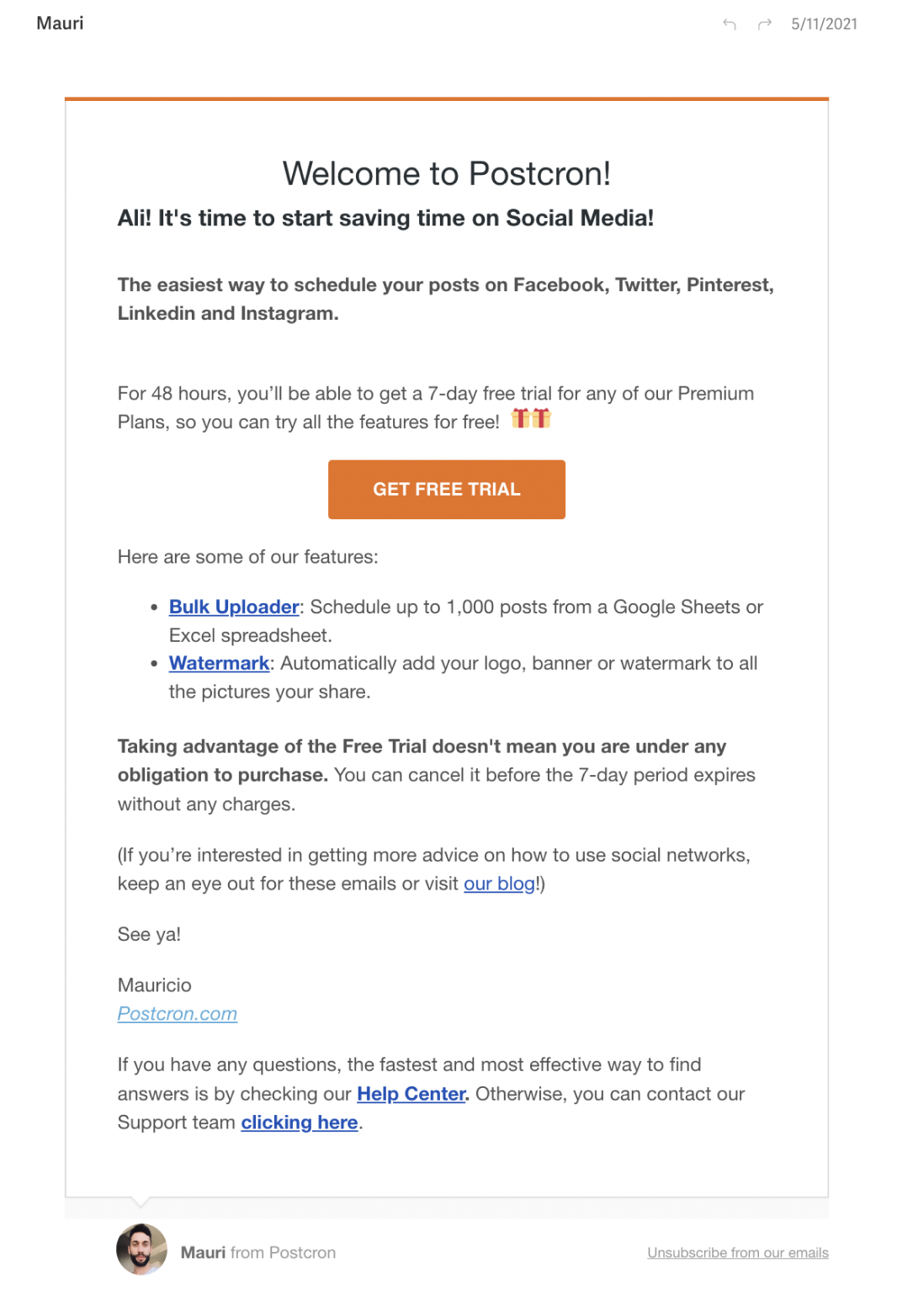
Amazing Example: Postcron
✅ Re-enforcing value prop: Postcron helps you save money
✅ Time-bounding action: 48 hours to claim trial
✅ Clear CTA
✅ Addressing potential concerns
❌ Distracting Links: Blog, Features
✅ Fallback CTA: Relevant lower commitment next step (Help Center)
✅ Personalized Point of Contact
2. “Stand out” in a crowded space
Re-affirming your value prop & position your company against more established brands. This works for high-intent customers in a competitive market.
Good Example: Cuts Clothing
✅ User-focused Header image
✅ Re-iterating Value Proposition
✅ Easy To Digest Copy
Great Example: Headway
✅ Combing the Welcome Email with the Email Confirmation email
^ I thought this was a neat trick to capitalize on high open rates in confirmation emails
Amazing Example: n/a
I am yet to find a welcome email in this category that blows my mind.
3. Educate Customers
Educating users on a new market, you are pioneering. This works for lower-intent customers in a low-competition market.
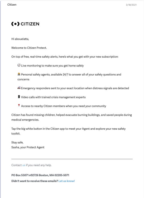
Great Example: Citizen
✅ Great copy for Key Features (simple & easy to scan)
✅ Re-iterating value prop: Help people during emergency
❌ Information Hierachy
✅ Personalized Point of Contact
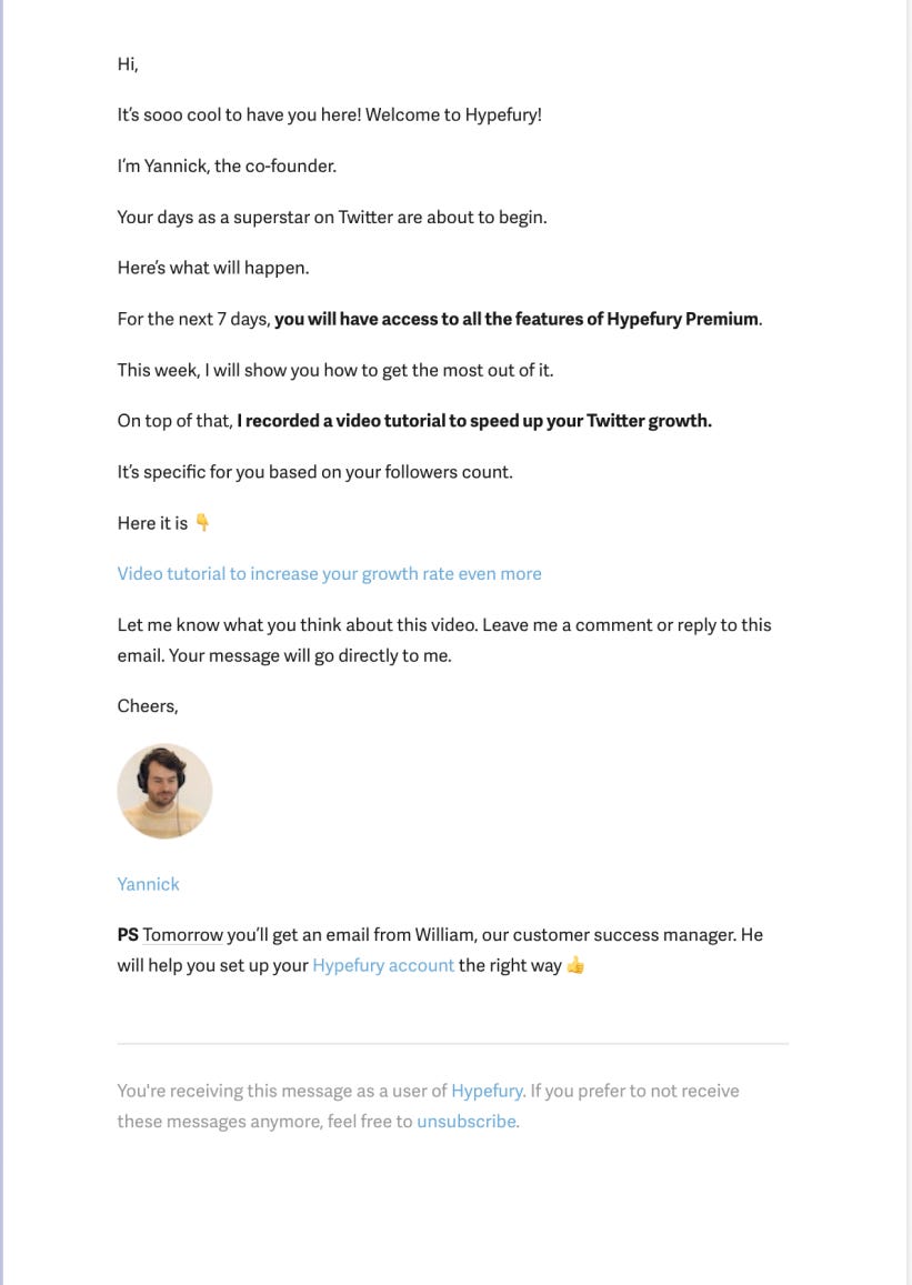
Amazing Example: Hypefury
❌ ”Hi” without my first name
✅ Re-iterating value prop: Grow on Twitter
✅ Priming users for onboarding series
✅ Personalized Tutorial
✅ Personalized Point of Contact
✅ Re-priming users for onboarding series
4. Next Step
Guide users to the next step in the funnel to reach their “aha” moment. This works for high-intent customers in a low-competitive market.
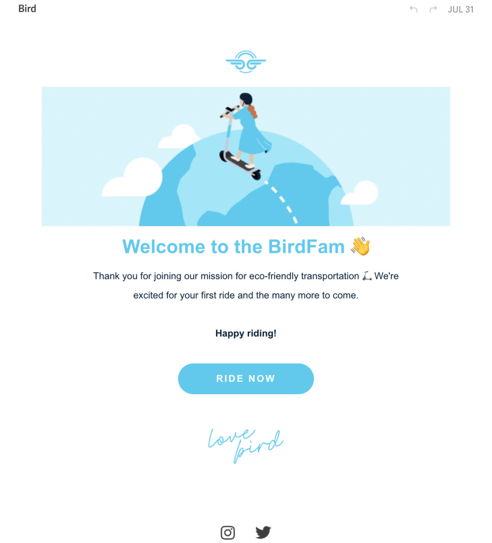
Good Example: Bird
❌ Generic Irrelevant Header Picture
✅ Short & to the point
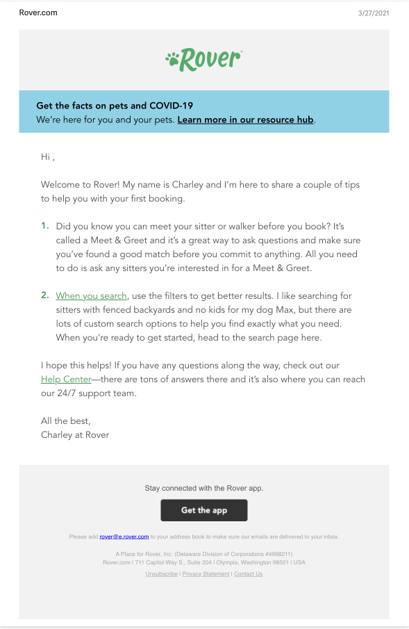
Great Example
❌ Distracting Resource Hub links
❌ ”Hi” without my first name
✅ Relevant lower commitment next step “Meet & Greet”
✅ Search Tips: training customers to extract value
✅ Good fallback CTA: Contact Support
✅ Well-placed Footer CTA
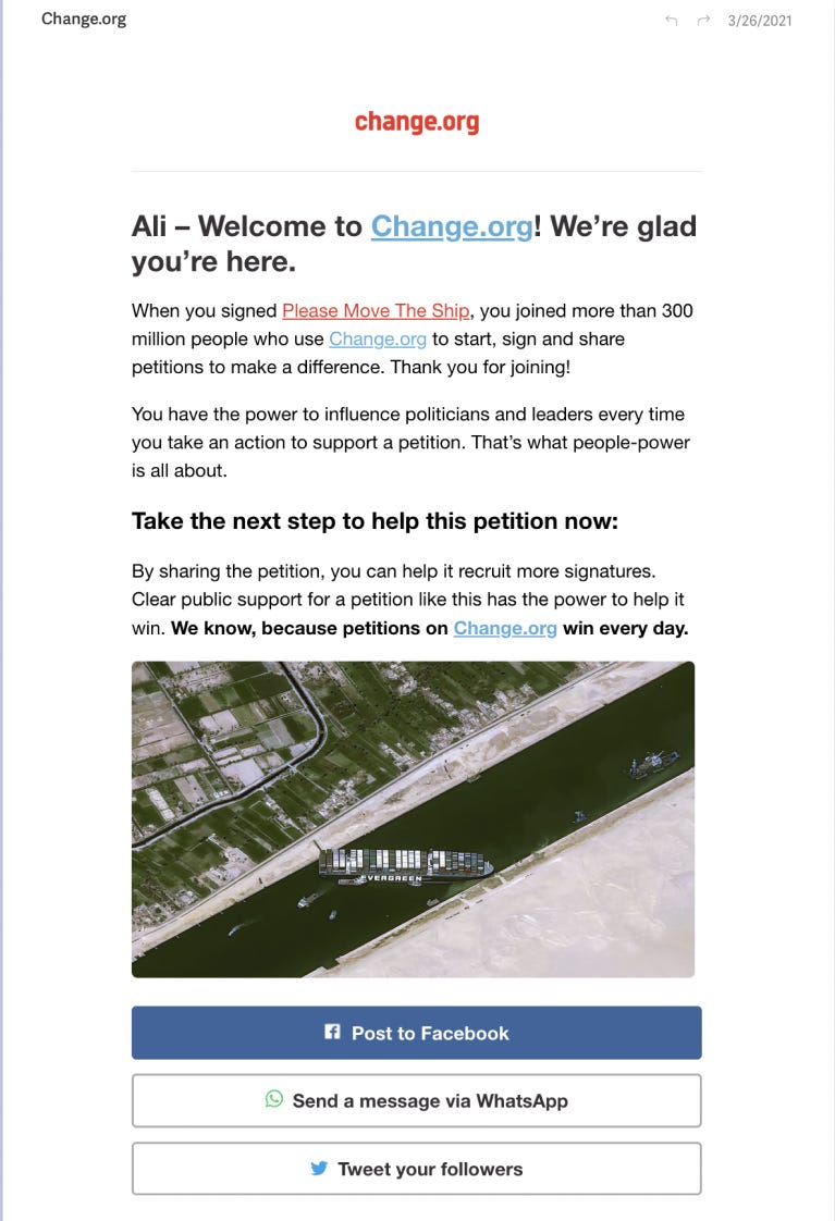
Amazing Example: Change.org
✅ Personalize Welcome Header
✅ Personalized Content based on my prior interactions
✅ Re-iterating Value Proposition
✅ Clear Next Step: share petition
✅ Clear Benefit of taking the next step
✅ Personalized Image based on my prior interactions
✅ Clear CTA: Facebook Share
✅ Clear Fallback CTAs: Whatsapp Share, Twitter Share
Putting it all together:
An effective welcome email:
Has a primary CTA that is aligned with the market competitiveness & customer intentions
Is focused on 1 action & avoids distractors (multiple CTAs, generic images..etc)
Has a secondary CTA that links to a lower commitment step along the activation journey.
Overcommunicates the one thing you are trying to say (it is in the header, footer, body, and images)
Is personalized to different end-users
This is it for today, see you soon 😉
Ali Abouelatta (@abouelatta_ali)

